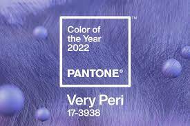
At Pantone, every year it is customary to release ‘Color of the Year.’ So, for 2022, Pantone, the provider of professional color language standards and digital solutions for the design community, has released their Pantone Color of the Year 2022 called “PANTONE 17-3938 Very Peri.” The new Very Peri is paired with versatile hues in a series of four palettes, available to designers as inspiration to incorporate into designs via the Pantone Connect digital color platform. Pantone Connect is available as a mobile app and on the web, and as an extension app for Adobe Creative Cloud to make capturing, curating, and designing with Pantone Color easy and accessible.
According to Pantone, the Color of the Year selection process requires thoughtful consideration and trend analysis. To arrive at the selection each year, Pantone’s color experts at the Pantone Color Institute comb the world looking for new color influences. This can include the entertainment industry and films in production, traveling art collections and new artists, fashion, all areas of design, popular travel destinations, as well as new lifestyles, etc.
In Packaging and Multimedia Design, Very Peri can engage the eye, making it an ideal shade for many applications of graphic and multimedia design as well as packaging.
PANTONE 17-3938 Very Peri illustrates the fusion of modern life and how color trends in the digital world are being manifested in the physical world. Digital design enables one to stretch the limits of reality, opening the door to a dynamic virtual world where one can explore and create new color possibilities. The Very Peri can help designers to embrace this altered landscape of possibilities, opening up to a new vision. It rekindles gratitude for some of the qualities that blue represents complemented by a new perspective.
The selection of PANTONE 17-3938 Very Peri brings a novel perspective and vision of the trusted and beloved blue color family, says Leatrice Eiseman, Executive Director, Pantone Color Institute. “Encompassing the qualities of the blues, yet at the same time possessing a violet-red undertone, PANTONE 17-3938 Very Peri displays a spritely, joyous attitude and dynamic presence.”
Laurie Pressman, Vice President of the Pantone Color Institute, adds: “Creating a new color for the first time in the history of our Pantone Color of the Year educational color program reflects the global innovation and transformation taking place. The complexity of this new red-violet-infused blue hue highlights the expansive possibilities that lie before us.”
Meanwhile, highlighting the power of color in digital design, Pantone teamed up with Microsoft to bring the PANTONE Color of the Year 2022 to life across Microsoft products – including custom Teams backgrounds, Windows wallpapers, a new Edge theme, and a PowerPoint template infused with Very Peri.


