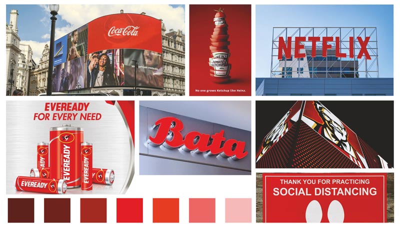
The SpiceJet airline’s tagline reads: “Red, Hot, Spicy”; 93.3 FM Radio Mirchi’s tagline is: “It’s Hot!”. And if you are a football or cricket enthusiast, look at the branding/uniform of some of the FIFA football teams or the IPL team, e.g. Royal Challengers, Bengaluru, it is all RED! The
Breaking News tag is mostly highlighted by electronics media. The famous IndiaToday and Time magazine have used RED color in their branding. Look at CNN and BBC …their logos are in RED! In its summer campaign, Parle Agro has engaged Actress Priyanka Chopra to promote their softdrink ‘Fizz.’ The branding has come out very aggressive and appetiting, with RED domination along with BLACK color.
So, the buck does not stop here! Your thought process will begin a journey
to discover the world of RED color, the aggressive color indeed. Read these words and phrases surrounding the color ‘RED’ ,viz, RED letter day, RED Alert (for fire, flood, cyclone, terrorism), red-herring, Danger, STOP, FAIL… and red has connection with nature – red birds, tomato, carrot, Chilly,
Apple, Strawberry, Red Rose, Water Melon, Pomegranate. And there other situation associated to RED … ‘The King received a RED Carpet’, Red Zone (during Covid19), Blood Bank/Blood Donation, Fire Brigade; in sports RED card is used to oust defaulting players (e.g. football_ for penalty), in traffic or railways RED signal means STOP, in spirituality RED bulb is used in meditation rooms, most of the temples have flags with red contrast, in Hindu worship red flowers are most preferred in Poojas; and the Communist Party (wherever they exist) have RED flags and branding. So, color RED dominates everywhere…and do not forget to visit the historic RED Fort in New Delhi! And, who does not want to watch a beautiful sunset at Mumbai’s Juhu beach or at a mountain valley of Mount Abu, with such reddish contrast spread all over the sky. Even there were controversies, e.g. International RED Cross Society objected the use of RED CROSS by medical shops across the world. Now medical shops have GREEN CROSS! (By the way, contrary to such a wide spread dominance of RED color, nature is GREEN and you cannot keep watching constantly something which is RED!)
Red is the iconic color for not only global brands but even petty shops on the streets of India. Many corporate brands use red in their logo. Brands such as Kellogg’s, Lay’s, Coca-Cola, Redbull, KFC, McDonald’s, Pizza Hut, etc have logos in RED. It feels bold and energetic. They recognize that the color conveys powerful and energetic emotions, especially when you move around a garden which is full of red roses and other red flowers. YouTube uses the color red to entice viewers. Watch how the red part of their logo
digitally enabled to attract people get into action. Look at PDF logo, Adobe Photoshop logo…they are in RED. Even online gaming, online lottery, and scamsters use RED to lure the target audience and get them trapped.
It is learnt that in color psychology, red is the most intense color. It can provoke the strongest emotions. The color red tends to encourage appetite. The color red builds excitement. Color RED truly brings richness to design elements. RED color is essential to producing stunning, impactful designs.
It is such a boldest colour that it stands out in any work of art. Red is used to contrast with its surroundings, drawing the viewer’s attention.
The color red creates a sense of urgency in sales; while walking on the streets in a busy market, consumers get attracted when a display board is put up on the door of the shop to announce some 20-50% discount sales. It also encourages appetite.
Let’s ponder a while with these questions on RED color! Why is that most of the corporate, organizations, sports teams, political parties, and even petty shops prefers color RED in branding and promotion?
What is the colour perception about RED globally?
What are the challenges in reproducing the given corporate color such as RED, because there are so many variation of RED in terms
of contrast?
How do the corporate, design people create the specific color such as RED and how do they achieve it, technically … after several rounds of approval process from the top management?
Coming to printing, what are the challenges involved in matching the color as per brand color?
How does color reproduction differ from substrate to substrate and its color? (E.g Fabric (t shirts), Sunpack, Glass, Paper and paper board, PVC, Vinyl, Wood, Mdf, flex, Plastic, acrylic, metal, etc? And brands are fanatic about their brand color and will ask designers and printers to match their color exactly without compromise.
That means, there are some critical elements in printing (and challenges):
1.Type of substrate
2. Color of substrate, challenges of printing colors including red on colored substrates.
3.Color matching to above parameters to reproduce the targeted brand color.
4. Drying/Curing process. E.g. in ceramics or in fabric the color, what we originally print may slightly undergo change after passing through the hot dryer/curing system.
5. Pre Press, Press and Post press technicalities.


