


Walk through any Indian street and you’ll know where you are long before Google Maps tells you. It’s not just the food, the faces, or the language that gives it away.
It’s the signs.
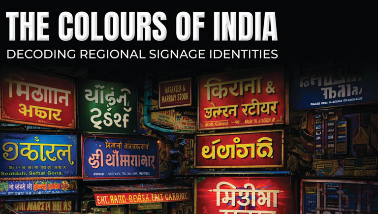
The red-gold acrylics of Gujarat, the handpainted nostalgia of Kolkata, the cinematic billboards of Chennai, and the polished LEDs of Mumbai all hum in their own visual dialects. Together, they form India’s most democratic design movement: signage.
What began as simple identifiers of shops and streets has quietly evolved into a living archive of our regional aesthetics. Every letterform, colour, and lighting choice reflects something deeper: our climate, our commerce, our culture.
In North India, signs shout with celebration; in the East, they whisper through handpainted poetry. The South builds them like movie sets, while the West shapes them like business cards.
This issue of Sign & POP World Magazine explores the fascinating intersection where design meets identity.
We decode how regional palettes, linguistic layers, and material preferences shape India’s visual vocabulary, a vocabulary that is instantly legible even without reading a word.
As digital screens and smart displays light up our cities, the question becomes: will technology flatten these differences or
amplify them?
Our bet, and our hope, is on the latter. Because in a world chasing
standardisation, India’s true power lies in its beautiful irregularities.
After all, it is these local colours, imperfect, loud, handcrafted, bilingual, sometimes blinking, that make our nation’s signscape uniquely ours.
They are not just directions or advertisements; they are identity made
visible.
Editor’s Note
Why this story, why now Every few years, we pause to look at the future of signage, smarter screens, faster technology, and better materials.
But this time, we wanted to look inward, at what already makes our industry so alive: the unmistakable local heartbeat behind every board.
In 2025, as design conversations revolve around automation and AI, India quietly continues to craft signs that still carry the warmth of the human hand and the pride of a local tongue.
This story is our way of celebrating that diversity.
Every region, every colour, and every script has something timeless to say about who we are not just as designers or fabricators, but as storytellers of a nation built on visual identity.
— Editorial Team, Sign & POP
World Magazine